23/03/2026
A new image for Resol's new era
At RESOL we understand that a brand is not only how it looks, but how it expresses itself, how it connects and how it evolves over time. That is why this new image is not just a visual change, but a clearer and more coherent way of showing who we are today.
A brand designed for real life
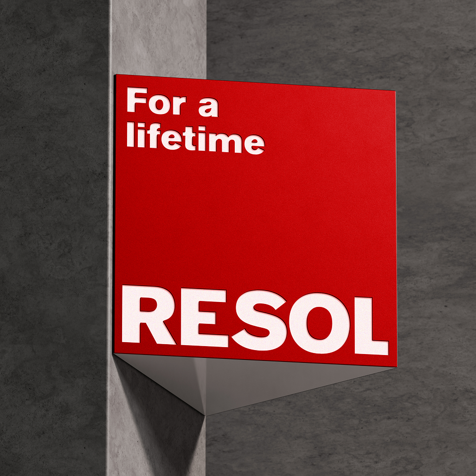
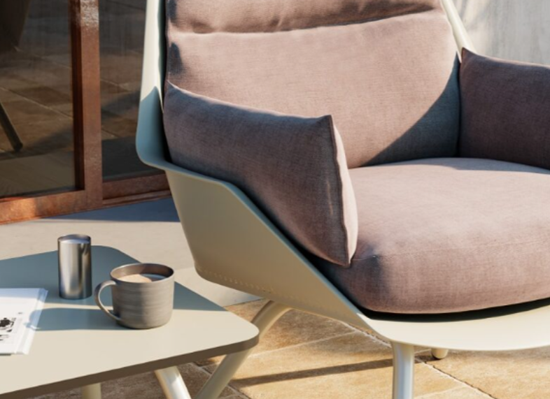
Resol's new identity is built on a key concept: life-proof. Products designed to withstand everyday use without sacrificing design, functionality or experience.
We are not just talking about aesthetics, but about durability, sustainability and real use, values that give meaning to our claim "For a lifetime". We design furniture that is designed to last and continue to add value over time.
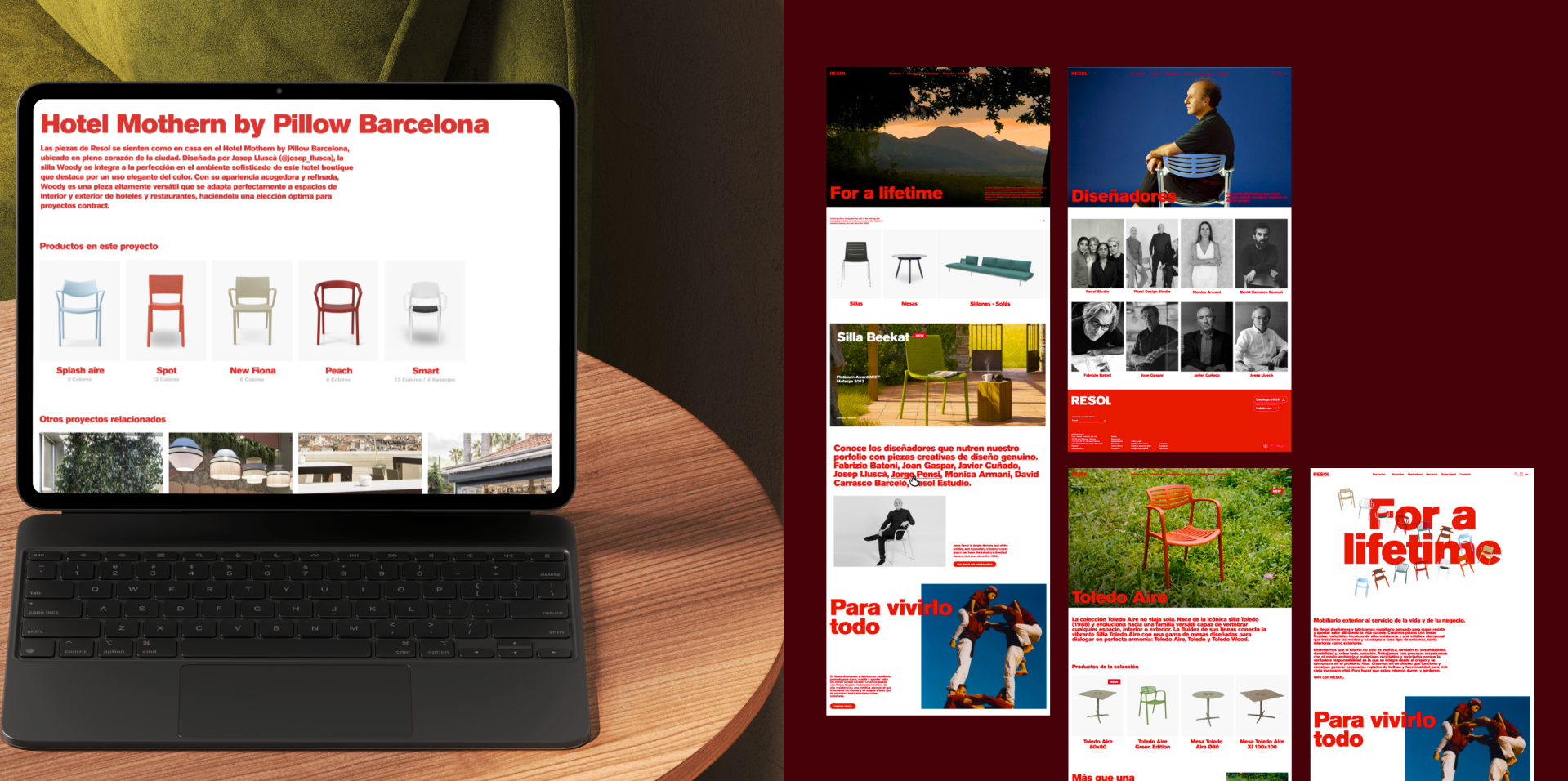
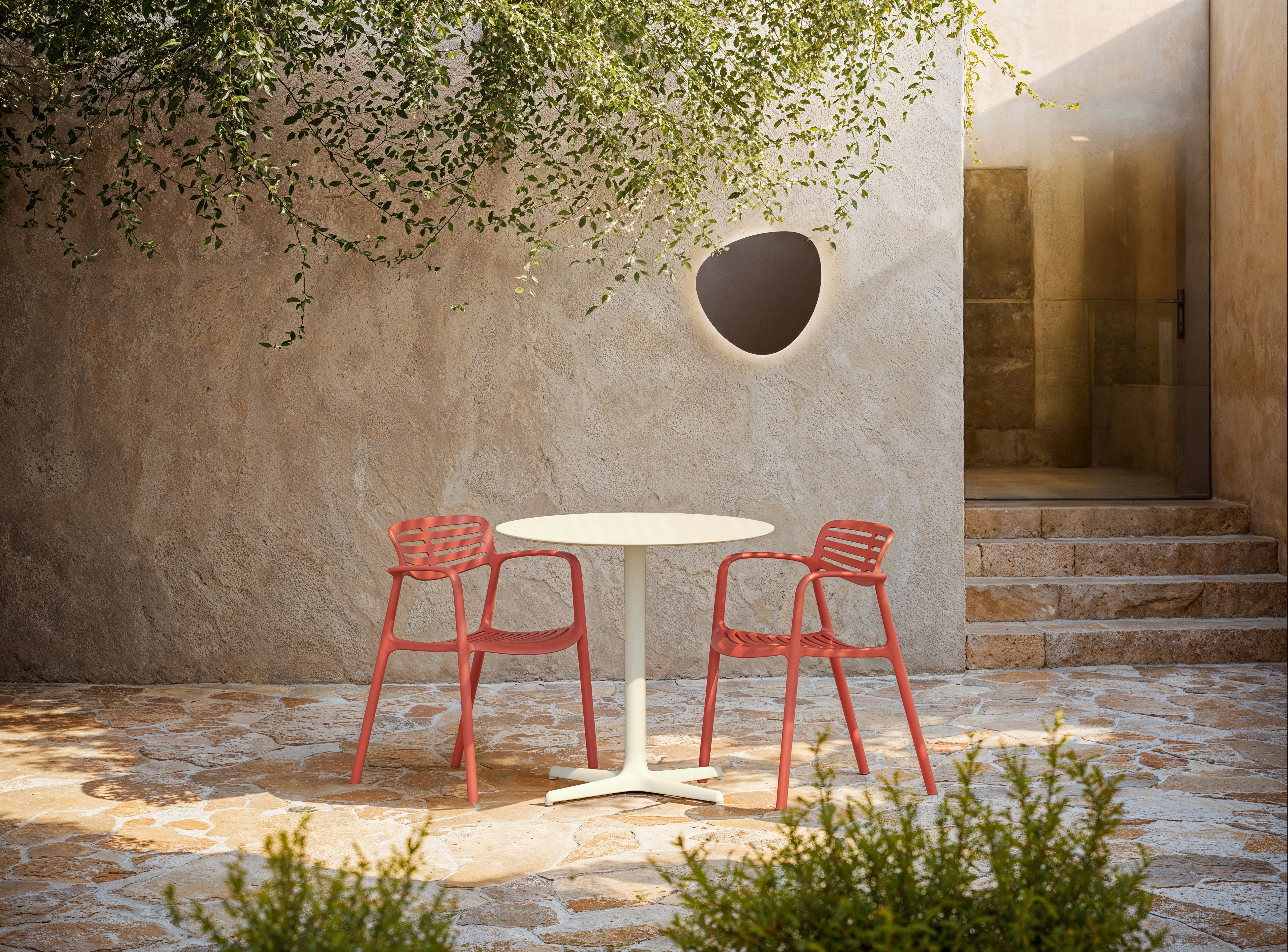
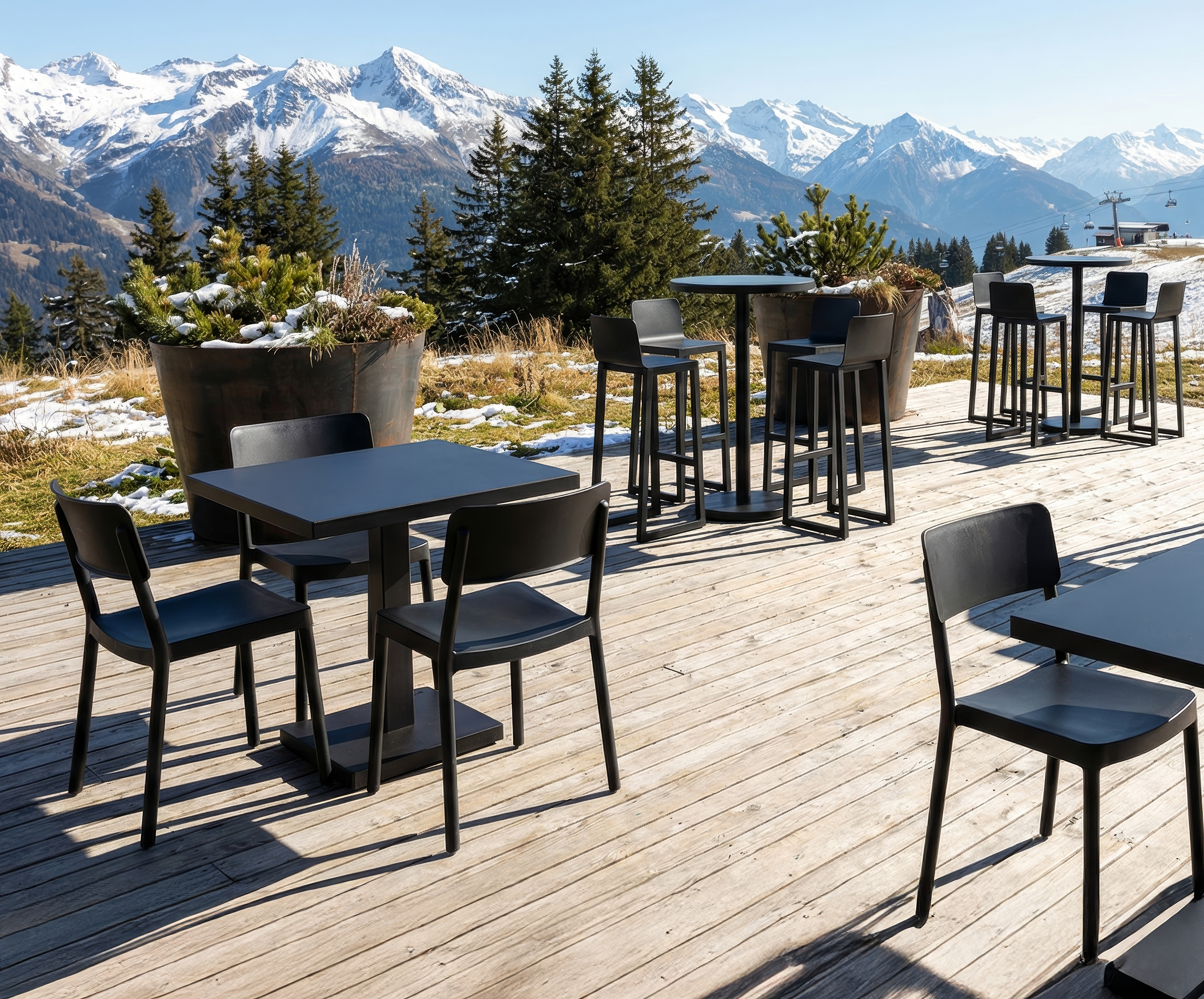
This vision is also transferred to how we show the brand: the products are no longer presented in isolation but are integrated into real and credible contexts, where it is understood how they are used, how they are lived and what role they have in each space.
A clearer, more coherent and strategic visual language
RESOL's new image is committed to a more ordered and recognisable visual system, where each element fulfils a function.
Colour becomes a strategic tool that structures communication and connects all the brand's points of contact: from catalogues and graphic supports to products and spaces. Everything responds to the same language, more coherent and solid.
On a visual level, this translates into a cleaner, more direct and contemporary communication, designed to make the product easier to read and to reinforce our identity in any environment.
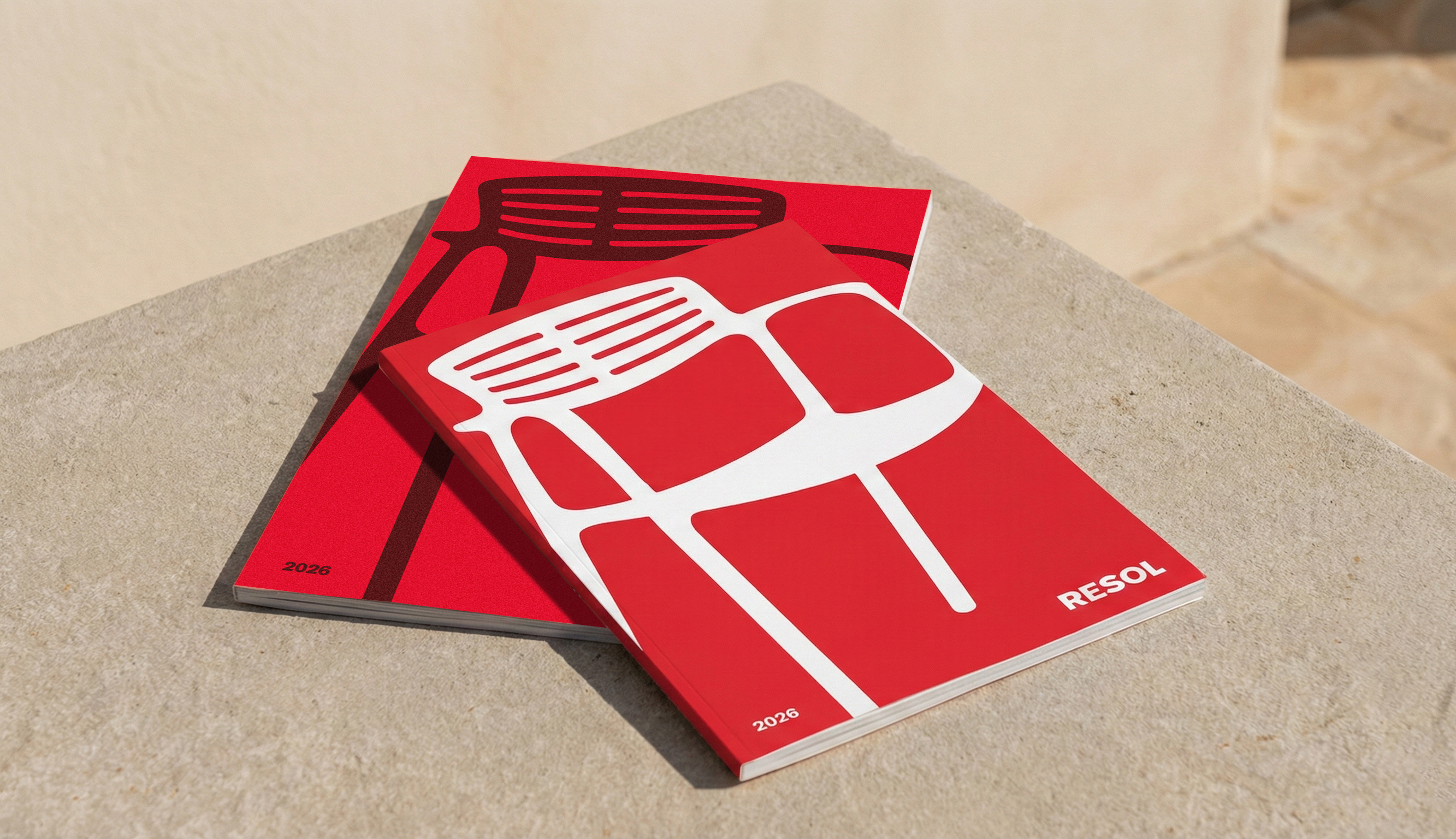
This is how the new brand is materialised
This evolution is already visible in the new RESOL materials: catalogues, price lists and commercial resources, designed to be clearer, more useful and visually attractive.
The new covers and applications reflect this way of understanding the brand: closer and more aligned with the daily use of our products.
A step forward that not only redefines how we show ourselves, but also how we want to continue growing: with a more coherent, recognisable and future-proof brand.